Bebeconfort

Bebeconfort Rebrand
2020 marked big change for the Bebeconfort brand. The brand lacked a distinctive positioning in the highly competitive juvenile market. To ensure Bebeconfort could successfully expand across wider markets, the challenge was therefore to rebrand in a way that connected deeply and authentically with parents.
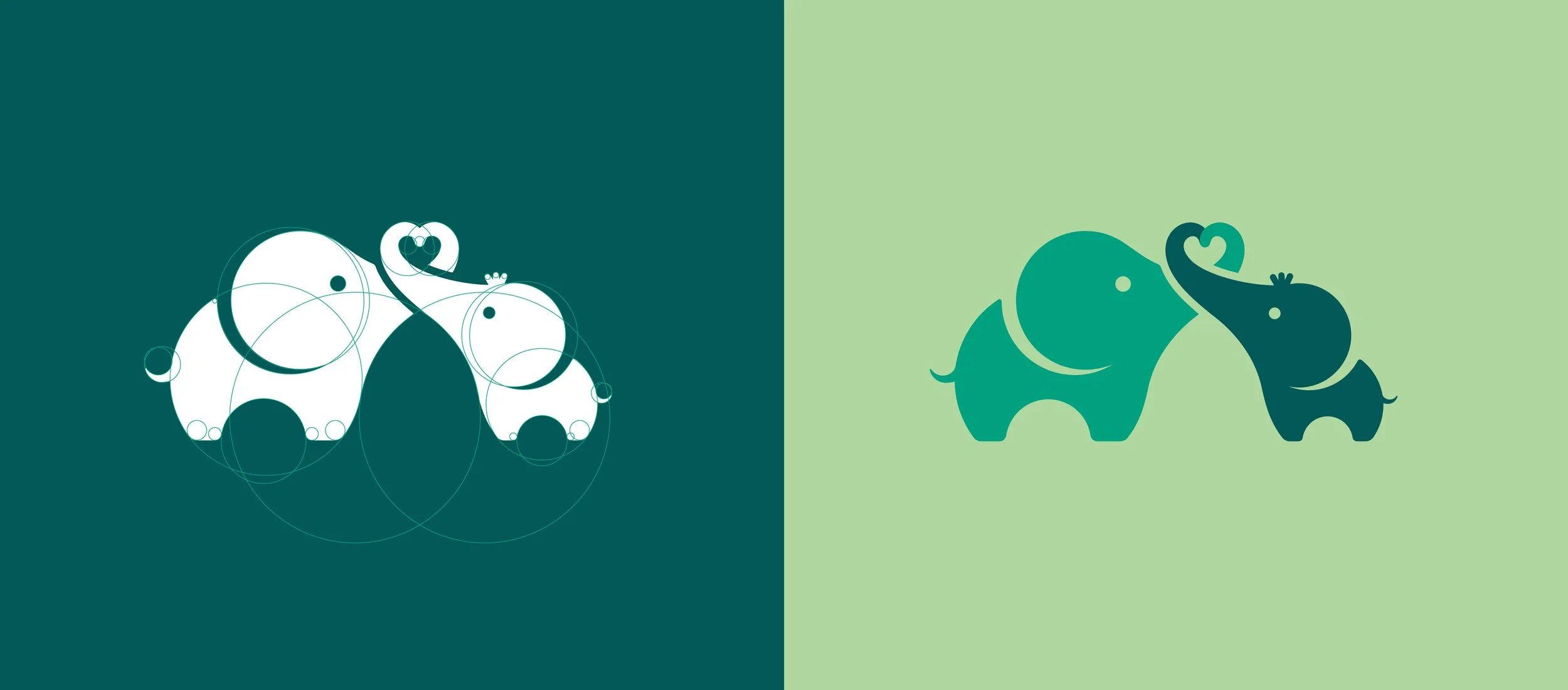
Cue Amsterdam-based strategic and creative agency The Brave New Now, tasked with this important evolution of the Bebeconfort brand. Together we crafted a new logo and colour palette.
We felt it was important to feature the elephant at the core of the new logo (the elephant was originally selected because it is recognised as being protective of its young, and a nurturing parent). Bebeconfort also sold a range of products and soft toys, based on ‘Elidou', an elephant character.
A green colour palette was chosen to inspire parents and reflect Dorel’s sustainability credentials.
Since the initial brand task, the talented team at TBNN have developed Bebeconfort's strategic brand story, packaging and social posts, to name but a few channels.
Dorel Juvenile is now implementing the refreshed brand identity to great success across wider European markets.


