


DESIGN / ART DIRECTION / TYPOGRAPHY / ARTWORK
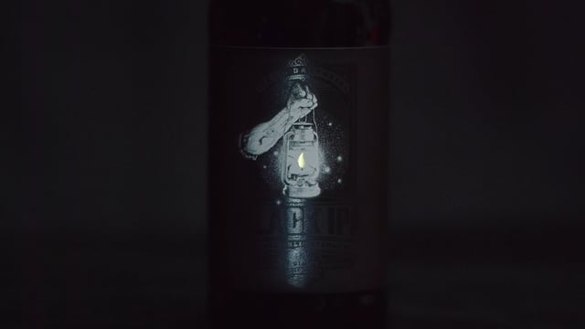
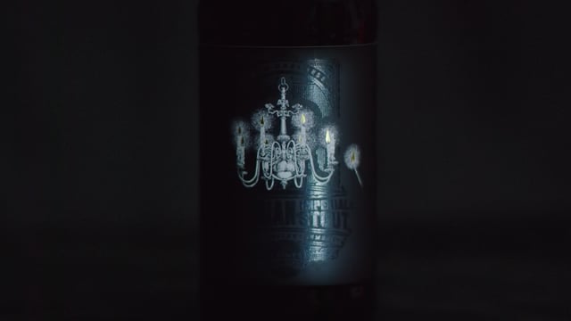
The ‘Black Box’ told the story of the blackest of tipples and the tales of madness behind them. When customers held up the Black Box bottles to the light, they revealed all - the labels were printed with spot varnish on matt black stock. From darkness came enlightenment - with only a single gold foil flame lighting the way.
2016 AIBA
Silver - Best Consumer Packaging
Bronze - Best Labels / Bottle Graphics
PRESS
The Dieline: View Article
Packaging of The World: View Article
The Australian: View Article
Yahoo News: View Article
Lucy Edison - Senior Designer / Art Director / Typographer / Artworker
Peter Ogden - Creative Director / Copywriter
Tim Waters - Illustrator